09.11.2021
Colors play a big role in our lives.They stimulate emotions and way you perceive the world. They can also determine consumer choices.
In 1810, the book “Science of colors” was published, in which Johann Wolfgang von Goethe first paid attention to the psychophysical nature of the phenomenon of color. His theory is the most up-to-date and through numerous studies has been extended to knowledge of how to define color by three parameters:
Color, i.e. the effect of mixing primary colors, seen more clearly than the others.
Saturation or how strongly we see a given color against the background of others.
Brightness or intensity of a color against a background of the same color depending on the lighting.
All this was the basis for clarifying the systems and color nomenclature as well as the basis for research on their psychophysical aspect. Nowadays science has developed so much that we also know how color influences our emotions and how we can see color by gender.
Color recognition is related to the type of X chromosomes. Women have two types of this gene. This gives them a greater ability to code genes responsible for distinguishing colors. Gender has an impact not only on the elimination of colors but also on our emotionality. Women and men perceive colors differently, which is often used by advertisers, clothing and interior designers. It is worth asking yourself: how to use the knowledge about colors in Visual Merchandising?
In “Merchandising in small and large commercial companies” Lucyna Witek defines the role of color in VM’s work as follows:
Colors evoke specific feelings and associations that are intended for the outlet and the products it offers. Color is therefore an integral part of the interior design of the point of sale and contributes to its effectiveness by: attracting attention, creating psychological and symbolic compliance, facilitating identification, increasing the effectiveness of remembering, and emphasizing contrast and enhancing aesthetic appeal.
Using this knowledge, we can design a place that will encourage you to shop from the moment you enter it! It is worth knowing this basic color division:
Basic colors are those from which all existing colors are made – derivatives. The basic colors are: yellow, red and blue. This knowledge will help you when we are looking for the perfect color of the walls. It is enough if we have pigments of these three basic colors to obtain unique colors. Basic colors and derivatives that we obtain from the combination of primary colors are pure colors. By mixing pure colors (more than two) with any other color of our palette, we will get broken colors.
Warm colors (ie yellow, red) affect us spontaneously, make our heart beat faster, which in turn speeds up the decision making. It encourages you to buy quickly, without much thought. It is worth smuggling these colors even in details.
Cold colors are worth using when we want the customer to stay with us for longer. In combination with light colors (e.g. white, gray), we get the effect of a modern interior.
Dark colors (mainly black) are used to give nobility and emphasize the credibility and tradition of the brand. Black color is attributed to luxury.
Another important rule about colors is the 3 colors theory. It is assumed that the human eye is able to clearly see and remember only three colors at a time. More colors cause cognitive chaos. In the visual identification of the brand, we usually find 3 main colors, and others can coexist as auxiliary – provided that they match a specific color scheme. This applies not only to the colors of paints, furniture or accessories used in the store, but also to the design of product displays. Adherence to the 3-color principle makes the layout of the goods more readable and allows for faster reorganization.
We have one more rule regarding the use of colors and it is: the psychology of colors. As experts have proven, the human eye, when perceiving a given shade, sends a nerve impulse to the brain, which is able to stimulate the appropriate organ to trigger a specific hormonal reaction. How does a given color affect our emotions?
When designing the showroom for the More & More brand in Hamburg, we focused mainly on cold colors. The walls are mostly white and gray. The target client of the brand is a conscious and self-confident woman. Open to innovation, appreciating elegant appearance and delicate patterns. She is not a spontaneous consumer decision maker. That is why the showroom has been crafted so that the customer feels there as an important guest who is welcome – for longer.
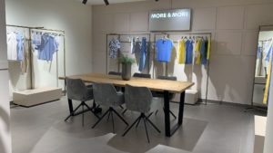
More & More directs its clothes to women who value an elegant look. For this reason, the smuggling of dark details was a key aspect. Black accessories – lamps, shop furniture, tables – give a strong and noble expression to a subdued interior.

Inside, three main colors are predominant, in line with the design concept of More & More stores. We find here mainly: white, gray, black and matching colors, for example, beige or gold.

Additional colors that build the atmosphere of the showroom are, for example, brown – in the wood. In the middle of the showroom there is a large wooden table where customers can view the latest catalogs. Thanks to this, the showroom gains a cozy, home-like character.
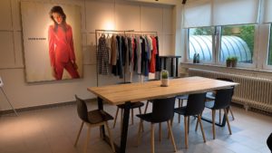
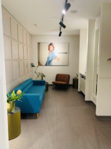
The showroom looks like home interior – it should resemble a standard store as little as possible. That is why, to arrange the interior, we use equipment typical for apartments, such as flowers, vases, lounge sofas, comfortable armchairs, carpets, bedside lamps, etc. In the showroom in Hamburg there is a blue sofa, which is supposed to be a place of relaxation and peace. Here, the customer can sit down and think about their purchases. The selected color highlights its function. In addition, inside we find many green flowers that bring harmony and life to the store.
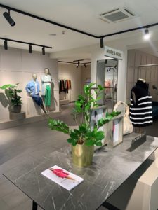
As you can see, you can achieve the desired effect with the play of colors. When planning the arrangement of the store, it is worth remembering about the color and its possibilities. The greatest potential lies in the right color study. It is easy to find satiety and caricaturality here. The Ergo Store Group has been comprehensively dealing with store design for many years. Experience and constant learning allow us to implement projects that bring profit to our clients.
05.03.2026
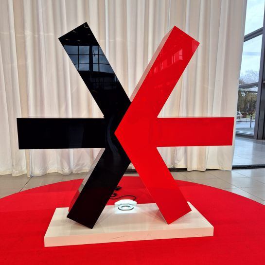
This year’s edition of EuroShop in Düsseldorf reaffirmed the importance of this event for the retail industry. For years, we have participated in the industry’s most significant events, which serve as a barometer of change in global retail.
26.02.2026
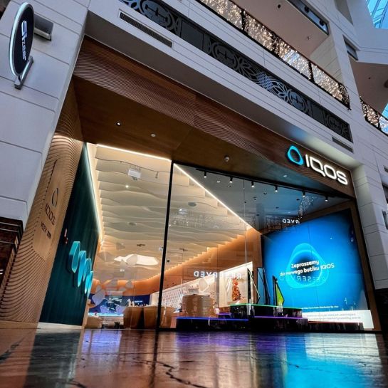
Over the years, we have observed the dynamic evolution of retail and the emergence of numerous new store concepts. We are particularly attentive to cohesive, technologically advanced solutions such as those implemented by Philip Morris International (PMI) for the IQOS brand.